- Published on
CSS Essentials for Developers
- Authors
- Name
- Full Stack Engineer
- @fse_pro


CSS (Cascading Style Sheets) is a fundamental technology for styling web pages. As a developer, having a solid understanding of CSS is essential to create visually appealing and responsive web designs. In this article, we will explore the essential CSS concepts and techniques that every developer should know.
Introduction to CSS
CSS is used to style the structure and layout of HTML documents. It consists of a set of rules that define how elements should be displayed on a webpage. CSS uses selectors to target specific HTML elements and apply styling rules to them.
CSS Selectors
Selectors allow you to target specific elements on a webpage and apply styles to them. Here are some commonly used CSS selectors:
Element Selector: Targets elements based on their HTML tag name. For example,
ptargets all<p>elements.Class Selector: Targets elements with a specific class attribute value. For example,
.buttontargets elements withclass="button".ID Selector: Targets a specific element with a unique ID attribute value. For example,
#headertargets the element withid="header".
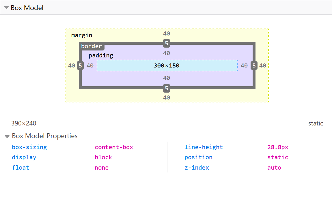
CSS Box Model
Understanding the CSS box model is crucial for creating well-structured layouts. The box model describes how elements are rendered on a webpage and consists of four main components:
Content: The actual content of the element, such as text or images.
Padding: Space between the content and the element's border.
Border: A line that surrounds the padding and content.
Margin: Space between the element and neighboring elements.
Responsive Design with CSS
In today's mobile-first world, responsive design is essential to ensure that websites look great on all devices. CSS provides several techniques for creating responsive layouts:
- Media Queries: Media queries allow you to apply different styles based on the device's screen size or other characteristics. For example:
@media (max-width: 768px) {
  /* Styles for devices with a maximum width of 768px */
  .menu {
    display: none;
  }
}
Flexbox: Flexbox is a CSS layout model that makes it easy to create flexible and responsive layouts. It provides properties for distributing space among elements and aligning them within a container.
Grid: CSS Grid Layout is a powerful two-dimensional layout system that allows you to create complex grid-based layouts. It provides control over both rows and columns, enabling you to build responsive designs.
CSS Preprocessors
CSS preprocessors like Sass and Less can enhance your CSS workflow and make it more efficient. They introduce features such as variables, mixins, and nesting, which can help you write cleaner and more maintainable code. Here's an example of using variables in Sass:
$primary-color: #3498db;

.button {
  background-color: $primary-color;
  color: white;
  padding: 10px 20px;
}
Conclusion
- W3Schools — Learn CSS
- web.dev — Learn CSS
- freeCodeCamp — Responsive Web Design
- Learn to Code HTML & CSS
- CSS Crash Course For Absolute Beginners
- HTML and CSS Tutorial
- CSS Masterclass - Tutorial & Course for Beginners
- MDN Web Docs: Mozilla Developer Network's CSS documentation is an excellent resource for in-depth CSS knowledge.
- CSS Secrets: A book by Lea Verou that dives deep into advanced CSS techniques and tricks.
- Frontend Masters: An online learning platform with CSS courses taught by industry experts.
Now that you have a solid foundation in CSS essentials, you can start creating stunning and responsive web designs. Happy coding!